top of page

FORMAT25
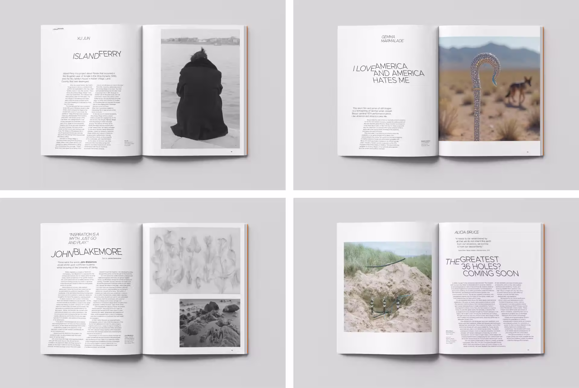
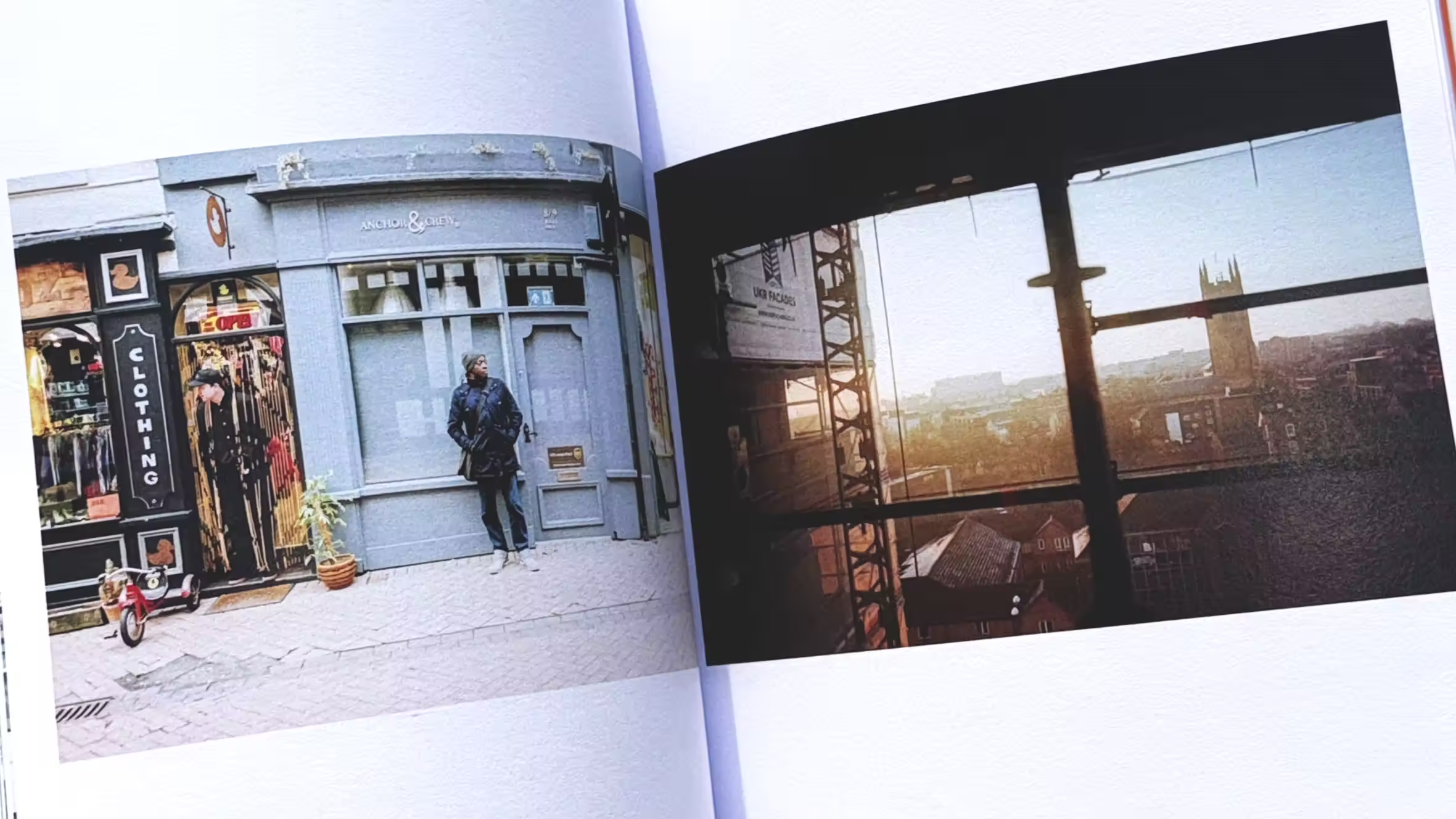
The FORMAT International Photography Festival is the UK’s leading contemporary festival of photography and related media, presented in partnership by QUAD and the University of Derby. Held biennially, FORMAT showcases a diverse range of photographic practices, spanning major conceptual works, participatory projects, documentary photography, mobile imagery, and archival collections.
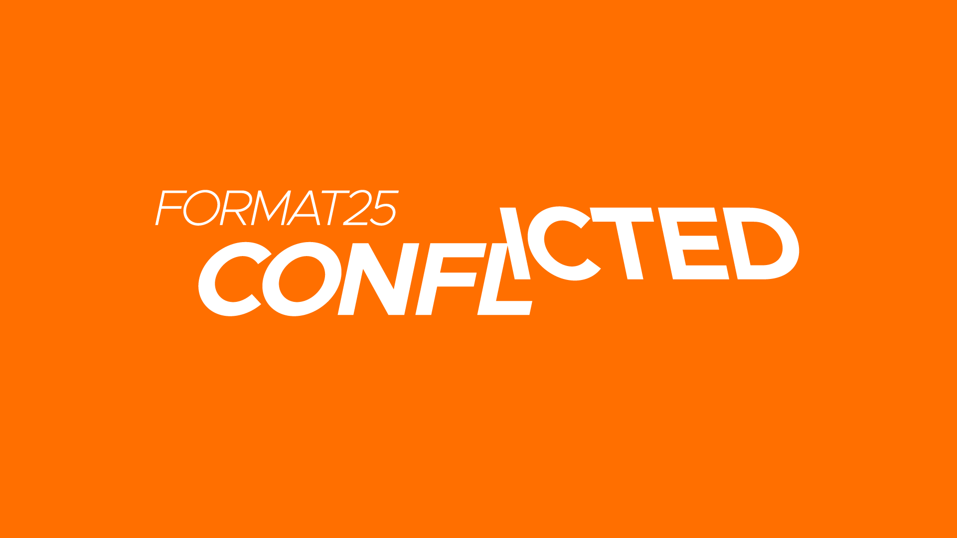
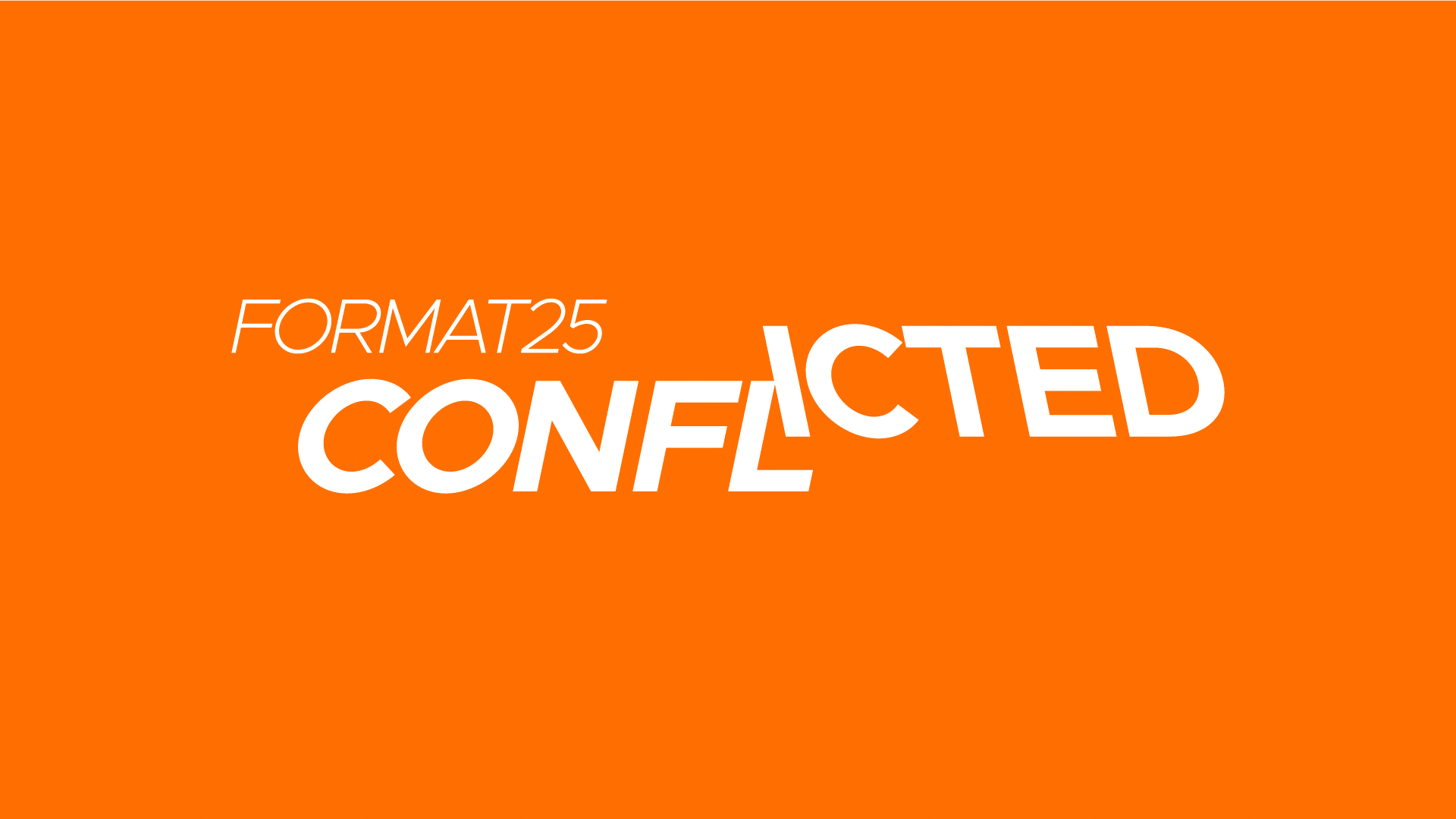
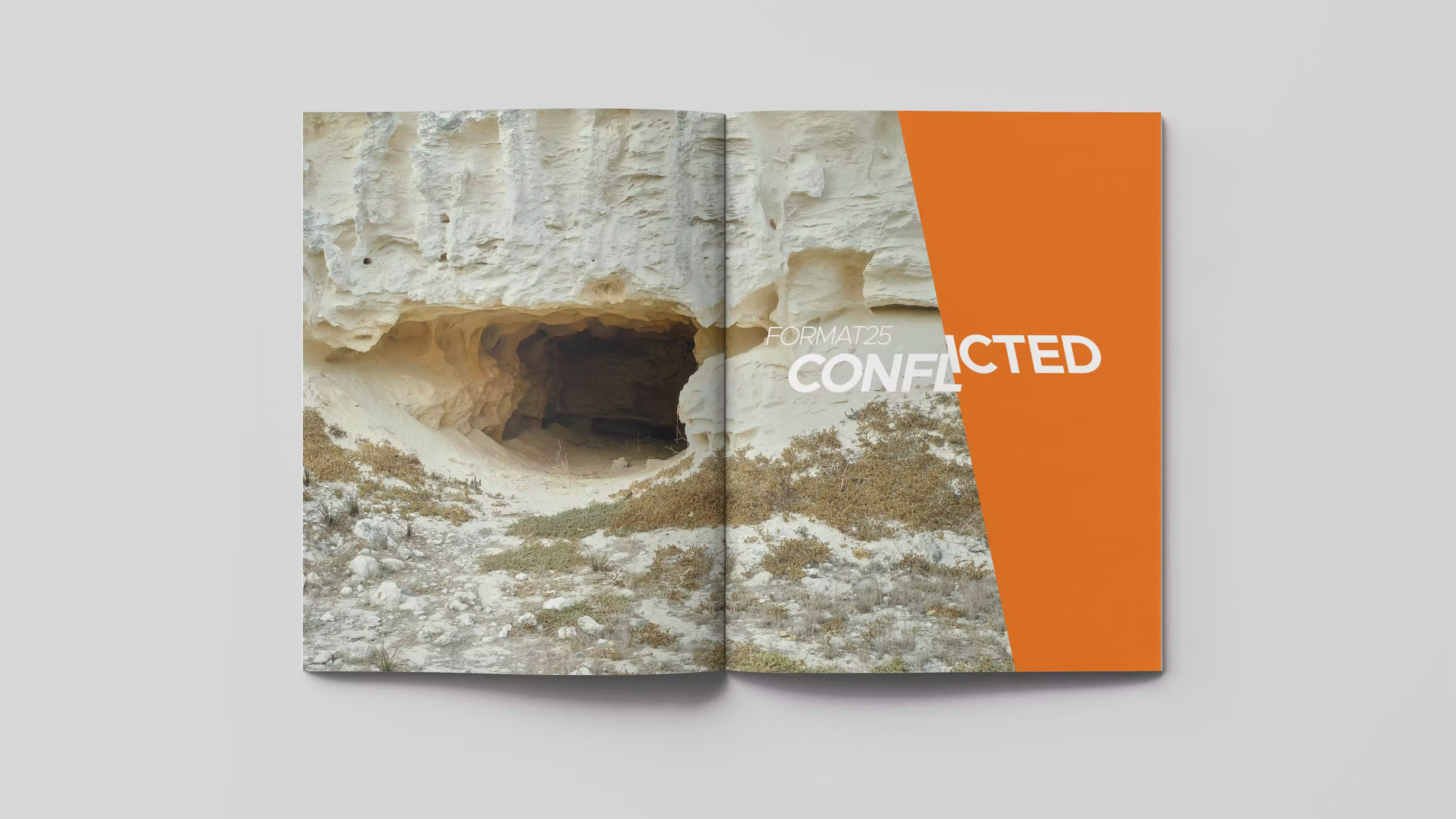
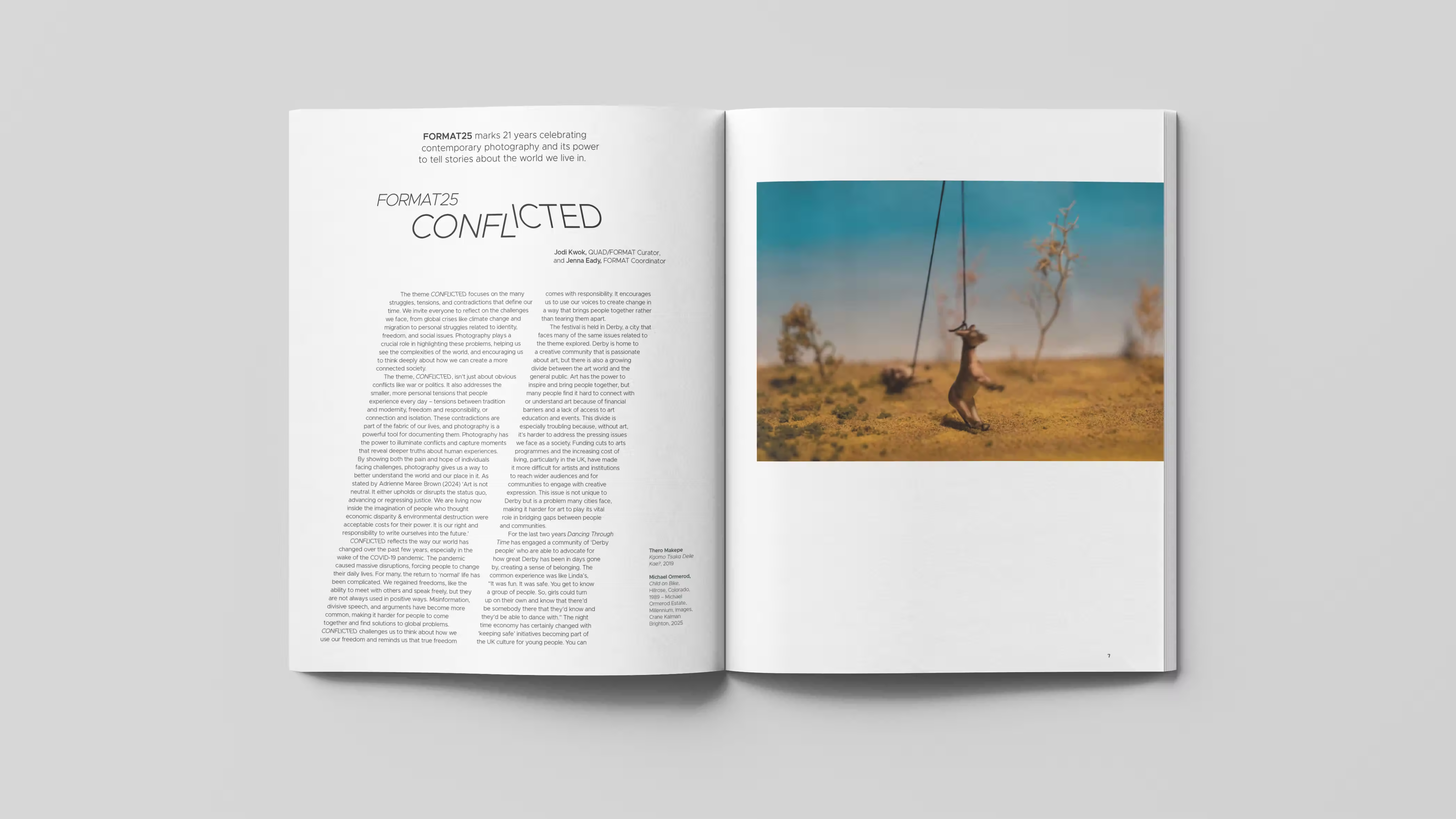
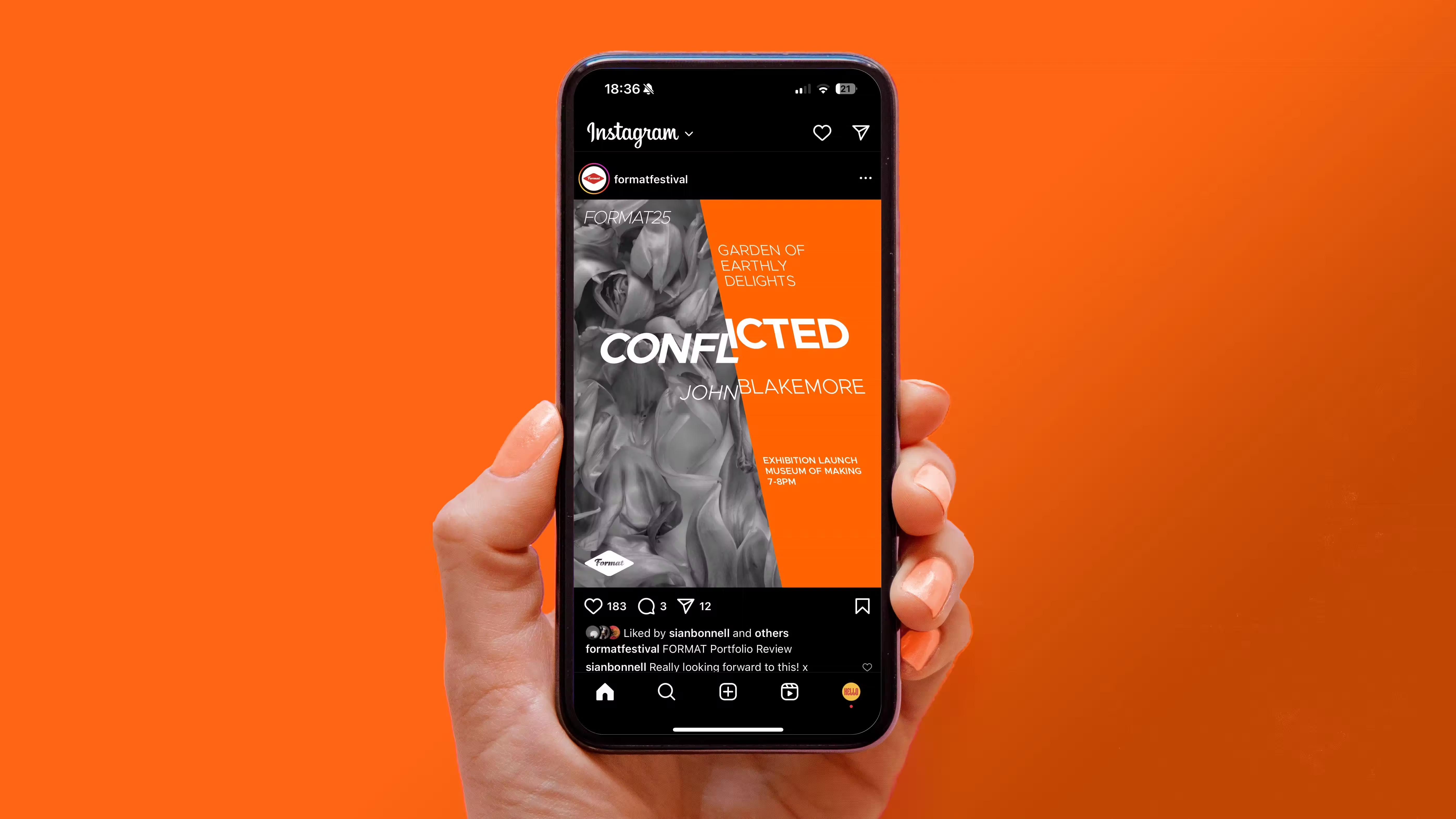
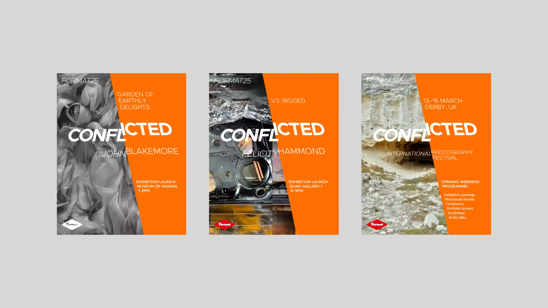
For the 2025 edition of FORMAT the festival theme is ‘CONFLICTED’.
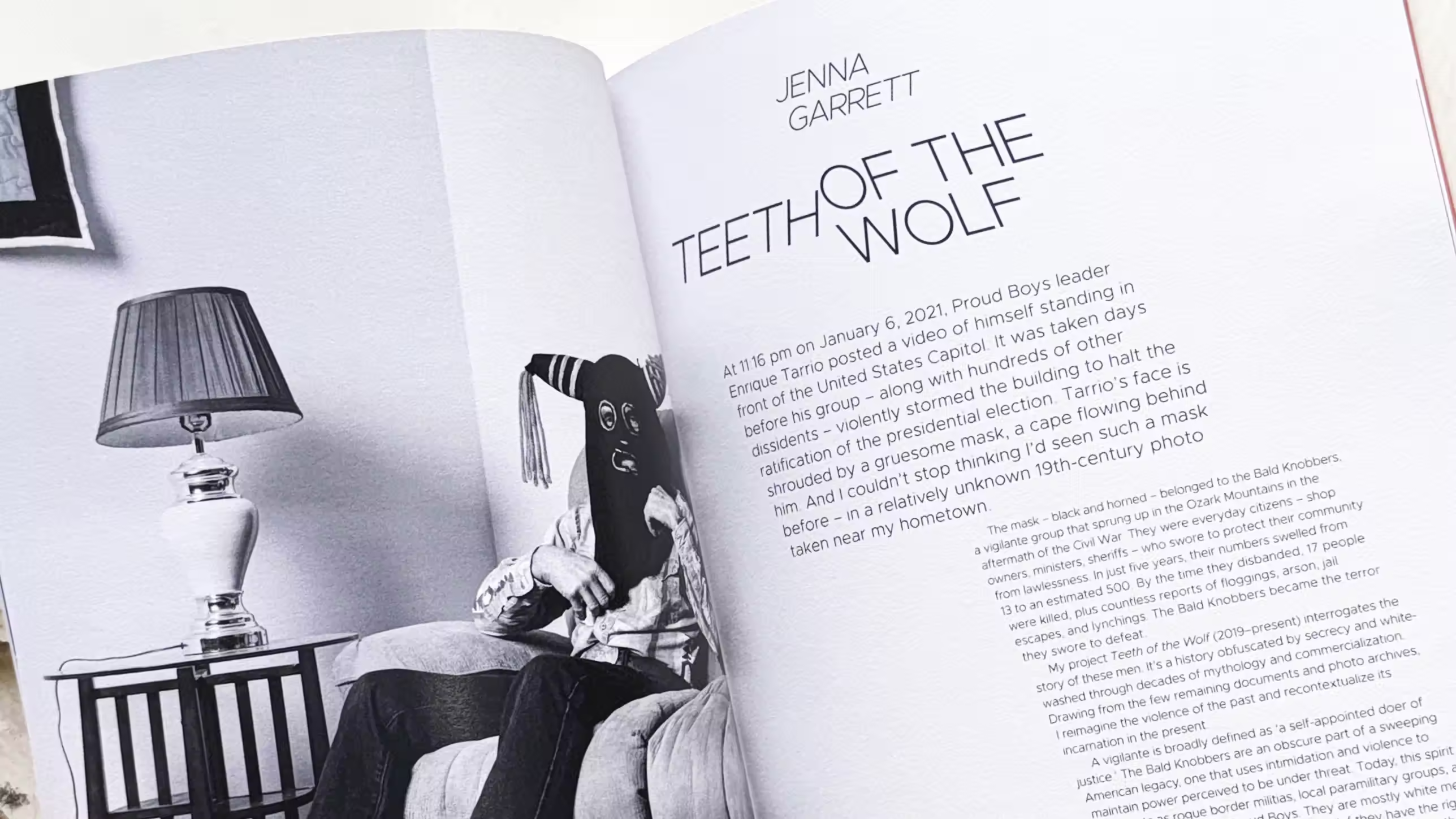
To visually represent this concept in the festival’s logo, we divided the word ‘conflicted’ and applied both italic and inverse false italic styles, creating a central area of typographic tension and dissonance. The baseline shift in the second half of the word symbolises differing perspectives and opposing viewpoints, while the bold orange hue was chosen to reflect the colour typically found in warning visual communications.
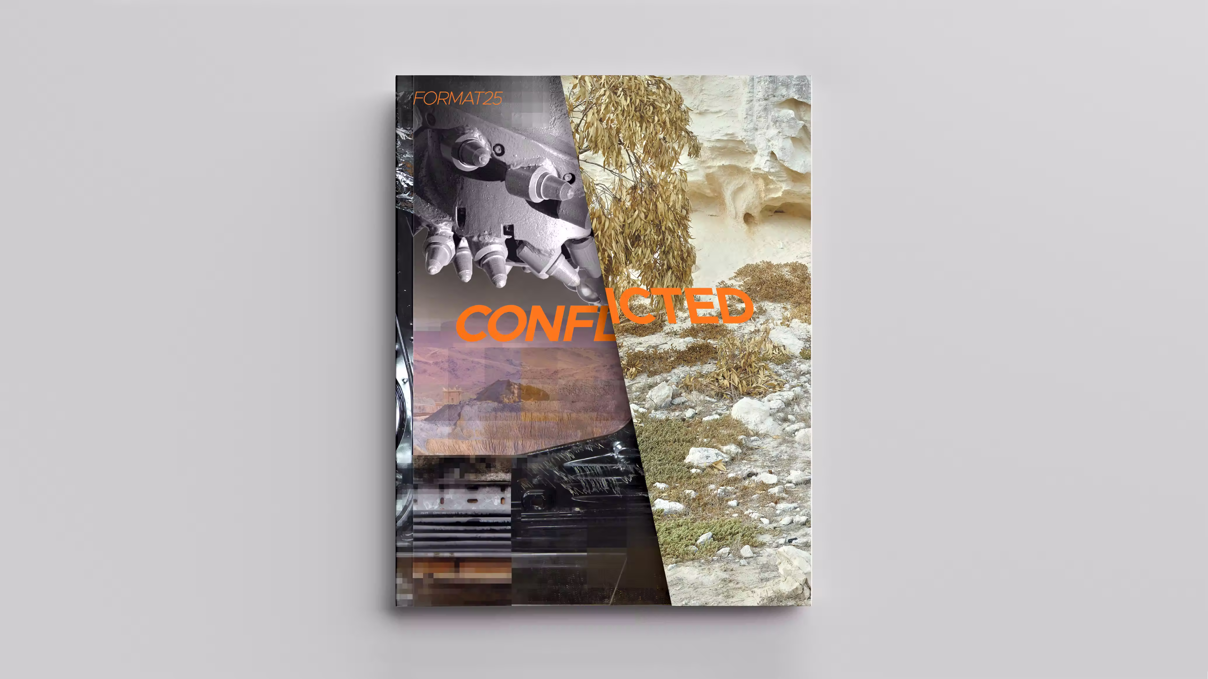
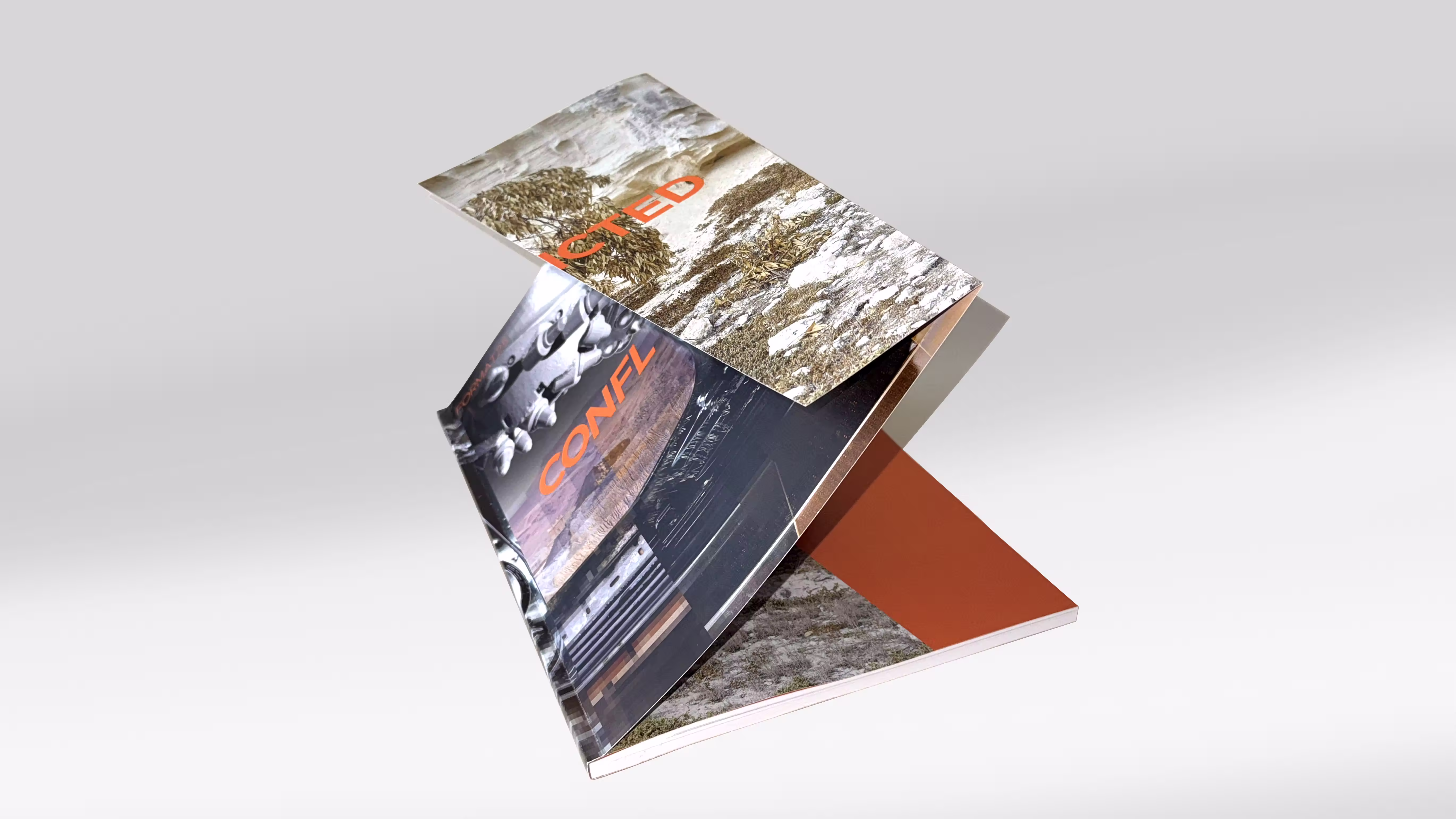
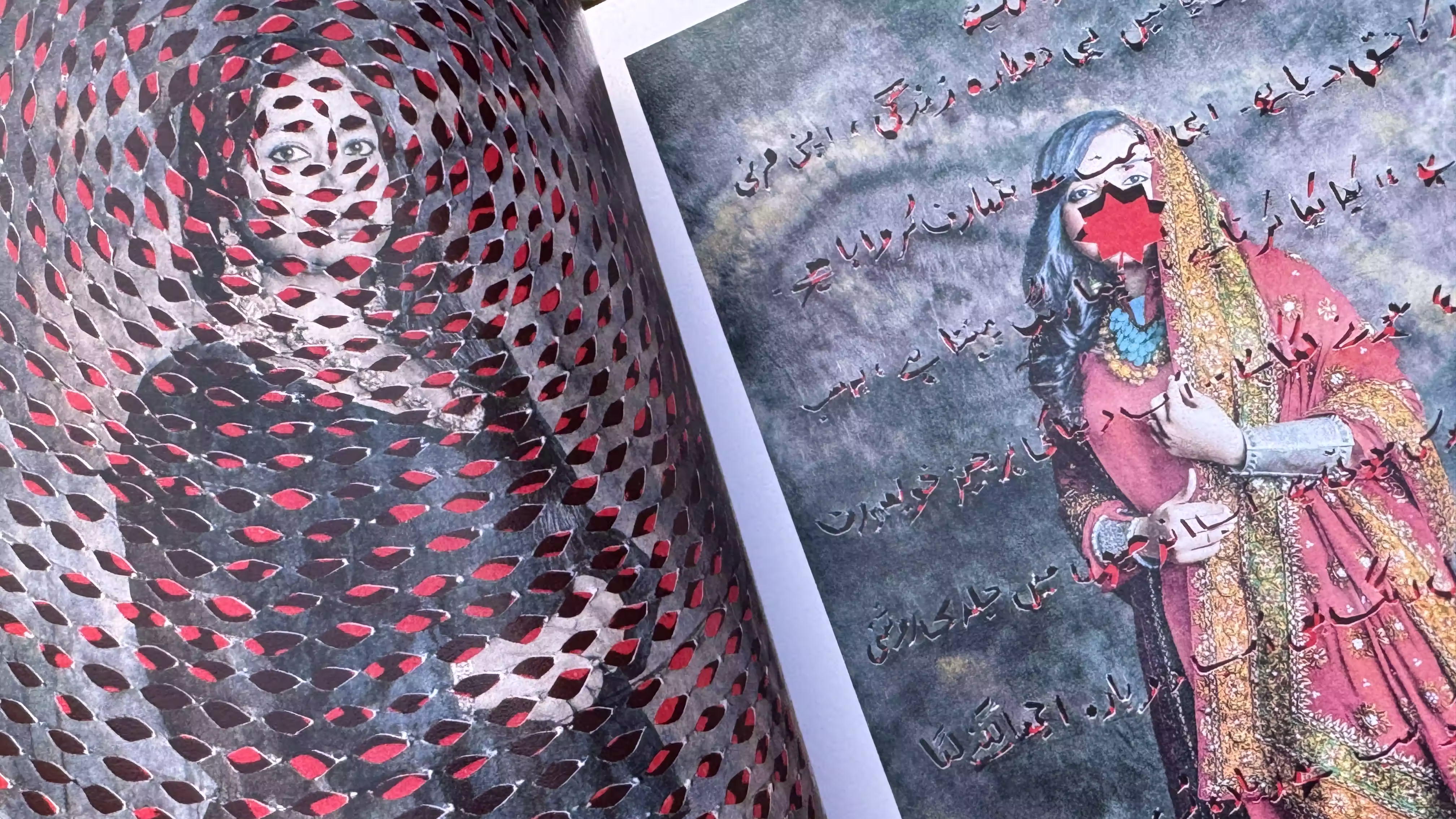
Expanding on this theme, the FORMAT25 festival catalogue further explores the idea of conflict through typography, extending the visual language introduced in the logo. Awkwardly positioned angled type sits alongside artists' images, reinforcing the theme of discord and contrasting viewpoints.
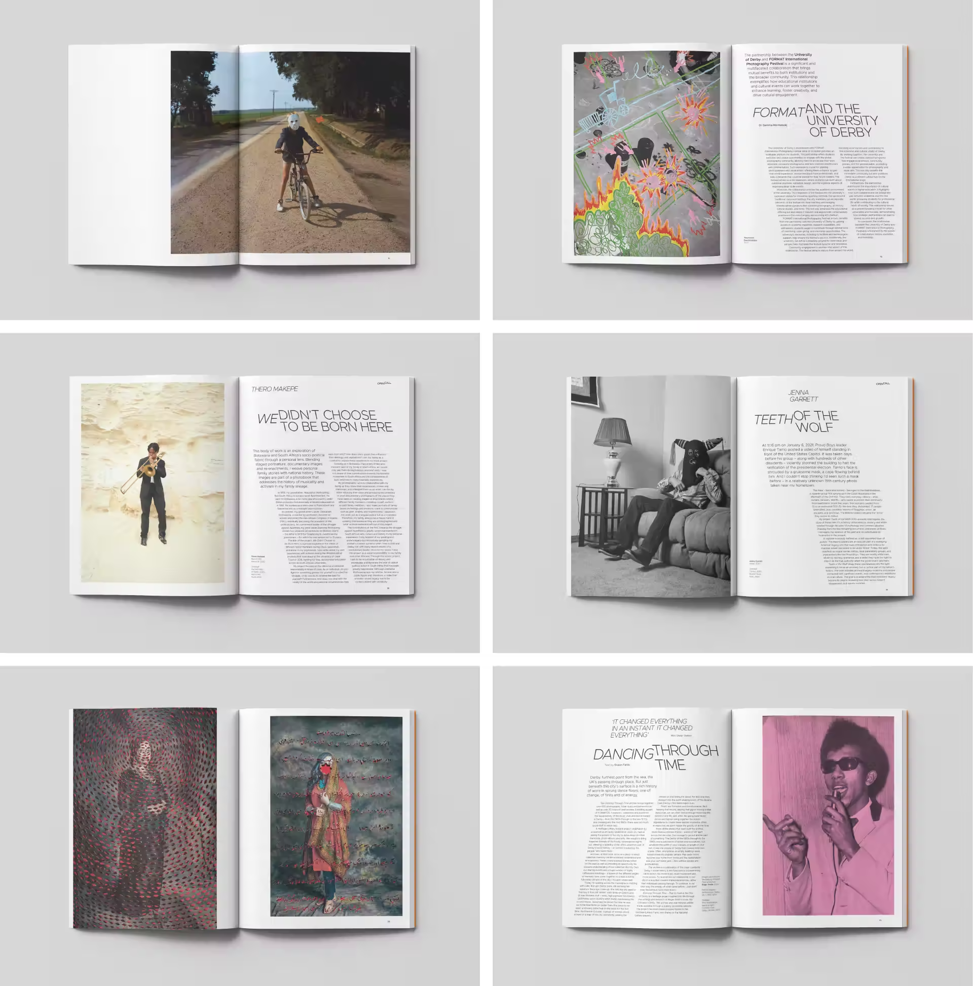
The FORMAT25 festival identity was implemented across all promotional materials, including supporting literature, social media campaigns, festival guides, and exhibition graphics displayed in venues across Derby City Centre.
Brand Identity, Typography

bottom of page